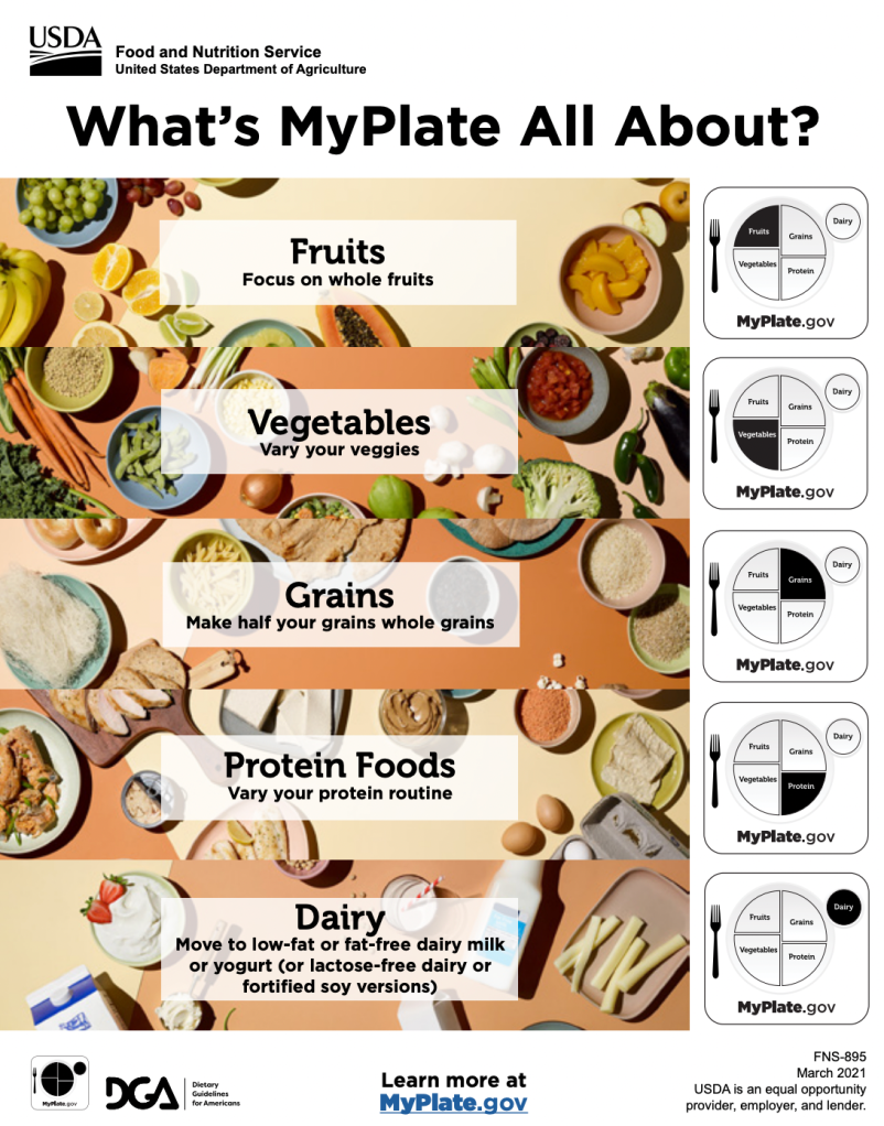
The “What’s MyPlate All About?” infographic from the USDA effectively communicates healthy eating habits through smart design choices.
Visual hierarchy is clear and intuitive. The bold title grabs attention, followed by a central MyPlate graphic that visually summarizes the message. Supporting tips and resources are organized in a logical, easy-to-follow layout.
Color choices play a crucial role. Each food group is represented by a distinct color, red for fruits, green for vegetables, orange for grains, purple for protein, and blue for dairy, mirroring the official MyPlate system. These bright, contrasting colors improve recall and help users quickly identify categories.
The typography is clean, with good contrast and legible font sizes. Bold subheadings and bullet points break up text, making the content scannable and accessible across age groups.
There’s a strong balance of text and visuals. The MyPlate graphic acts as a visual anchor, while short, actionable tips complement it without overwhelming the reader. Icons such as utensils and food group symbols enhance engagement and understanding.
Although it doesn’t include numerical data, the infographic tells a clear, educational story. It introduces a concept, explains it visually, and offers practical next steps. The concluding call to action and website link encourage further learning.
Overall, this infographic is an excellent example of how thoughtful design, using hierarchy, color, typography, and visuals can effectively educate and motivate healthy behavior.
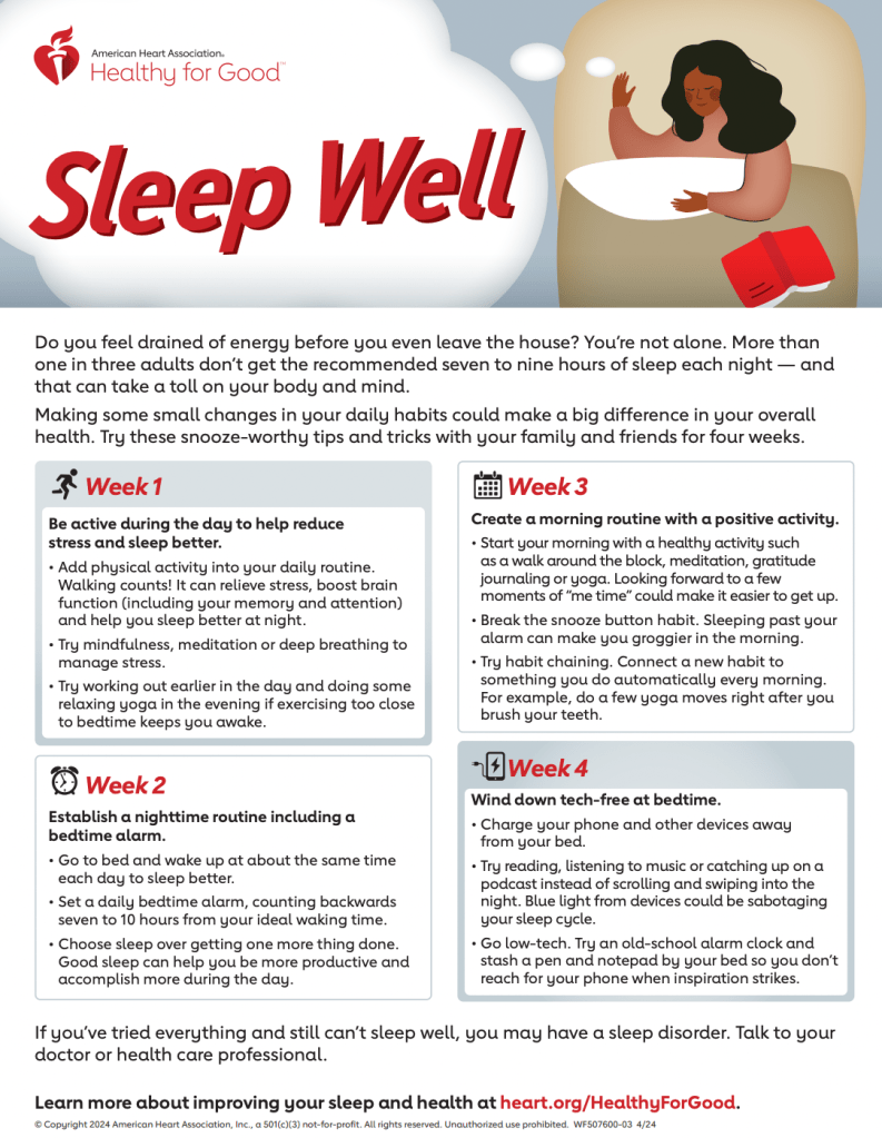
The “Sleep Well” infographic from the American Heart Association effectively communicates how to build better sleep habits over four weeks using thoughtful design and a clear, progressive structure.
Visual hierarchy is strong, with a logical week-by-week layout that leads the viewer through four steps. Each week is clearly labeled and paired with concise tips, making the content easy to follow and actionable.
Color choices reinforce the infographic’s message. The use of calming blues and purples evokes feelings of relaxation and restfulness, which aligns well with the theme of sleep. The soft background allows text and icons to stand out without creating visual fatigue.
Typography is clean and simple, using good contrast and spacing. The text is broken into short, digestible segments, with bold headings and bullet points that support quick scanning and comprehension.
There’s a solid balance of visuals and text. Minimalistic icons complement each week’s tip, reinforcing the message without overcrowding the space. This visual support makes the information more engaging and easier to remember.
Although it doesn’t present numerical data, the infographic tells a clear story—guiding the reader through a gradual, manageable plan to improve sleep habits. Each step builds on the last, offering realistic strategies such as limiting screen time and setting a bedtime alarm.
Overall, “Sleep Well” is an effective infographic. It combines calm visuals, simple language, and a clear structure to support lasting behavioral change.
Comparison
In my own infographic, I plan to incorporate similar elements from both examples, such as a concise format and clear, organized layout that makes the information easy to read and digest. I aim to blend the engaging visuals used in the “MyPlate” infographic with the practical, high-quality content found in “Sleep Well.” Analyzing these designs has given me a better understanding of what works well, and I’m excited to put my own creative twist on the topic while applying these effective design principles.

Leave a comment